Blast Arena started life as a superfun PC game in the 1990’s. A buddy and I wanted to write a souped up desktop version of a popular console game involving bombs.
Blast the Big Screen
Back then nothing was more important than smooth frame rate. It was second only to game play. My buddy and I did so much performance enhancement on that game that, when I took a long look at the source code, I knew it would not be feasible to port it over to mobile.
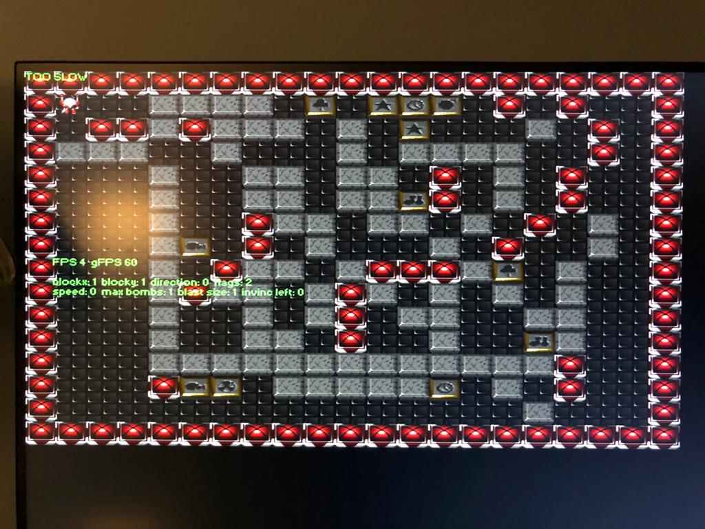
Here’s a screen shot of the game running on a modern PC. The Windows OS wouldn’t respond to any screenshot commands, so I took a photo of the screen.

It looked better on an old 1024×168 computer. I don’t remember it looking so 1990’s, though. If you squint you can see the power ups in a sort of gold with platinum inlays. The red orb things are indestructible walls.
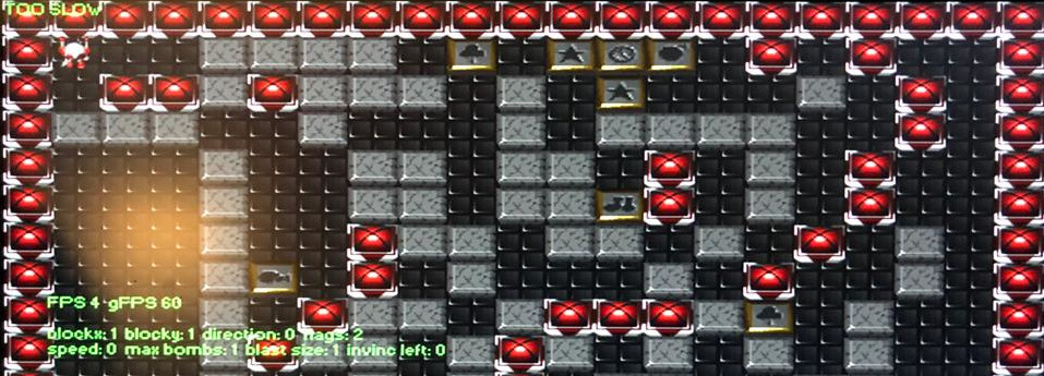
From the screenshot above, you can see that the game is running in a debug mode that shows some extra information related to debugging the game. If you look closely at the screen you can see that the game thinks it is running “TOO SLOW”. But the problem is that the CPU and GPU are so fast that the calculations for frame rate and game clock rate are over flowing.
The little guy on the upper right of the screen under the words “TOO SLOW” is our hero. We called him “Guy”.
Shrinking the Screen
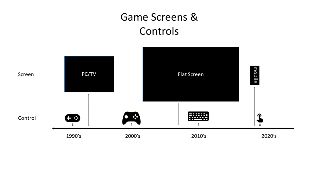
A mobile phone is smaller than a desktop monitor. The controls on PC or console game are very different from the controls on a mobile game. The figure below shows the popular screen sizes and typical game controllers during the 1990’s through today.

In the 1990’s, the PC was about the size of a medium sized television screen. Those screens measured 640 pixels across by 480 pixels down. The game controllers were very simple: a pad with four direction buttons and two to four action buttons. As time progressed the screens got bigger and the controllers got more complex. Game consoles like the XBox, PlayStation, and NES were where game innovation happened for the masses. While the large PC desktop monitor and gaming keyboard became the drivers of graphics and control innovation for the industry as a whole. The very best games were (and still are) made for large screens with complex controls.
During the 2010’s we see a sudden change in both screen size and control. The screen shrunk to the size of a human hand, and the device itself became the controller with various sensors to capture screen touch, temperature, current location on earth, and device orientation.
So, we threw out the old Blast Arena PC game entirely and pulled out the white board. Then we set about building a hyper-casual Blast Arena.
Blast Arena has to fit into your palm. We tried to transform the old Blast Arena PC game to the mobile phone. We did a complete arena redesign and moved the camera around to give the best possible view of the screen.
Proof of Concept
Below is the POC showing what Blast Arena could look like in 3D on a small screen. To keep the focus of the game design on game play and fun-ness, we’re keeping things simple. For the graphics, we use the simplest of visual objects. We will bring in the artwork, special effects, music, and sound later.The graphics consist of a flat plane filled with cubes. At this point the player model is a free 3D knight guy that Salty named ‘Ethan’, and a bomb that consists of a ball with sparkly on top.
Ethan drops bombs and they blow up destructible blocks. Sometimes there are shiny glowies under the block that Ethan can pick up.
Camera and Visual Controller
Because the view of the arena is so limited, we used various ways to alert the player about what’s going on in other parts of the arena that you can’t see. In the next demo we added a head-up display (HUD) on across the screen. The HUD stays out of your immediate field of vision, on the edges of the screen, while letting you know the direction of every player and bomb threat.
One of our biggest challenges, besides packing a full screen game into a palm-sized touchscreen, was the controls. We first tried having the player tap on the screen where they wanted to go, and then have Ethan move to that spot. Then the player would tap the spot they wanted to drop a bomb on twice to put a bomb there. It was as tedious as it sounds.
We tried putting control buttons on the screen and that didn’t work. The player would spend more time looking for buttons than trying to win.
We settled on a swiping motion to move Ethan around the screen and a tap to drop a bomb where he’s facing. It worked OK. But it was too easy to swipe too many times and move Ethan too far.
We designed some visual feedback to show the player how their actions were affecting Ethan. What we came up with, along with some camera adjustments gave us very satisfying results. The controls are easy learn (swipe to move, tap to drop a bomb). There are some extra actions too like bomb kicking (drop a bomb, swipe toward it to kick), and bomb throwing (drop a bomb next to a wall, swipe toward it to thow it over the wall). For the visual feedback for the controller we use a reticle in front and a trail behind Ethan.
Bye Ethan
Truth be told, Ethan wasn’t that much fun. He never brought any beers to pass around and he always talked with his mouth full while eating all the potato chips. Ethan was boring and cheap. Also, he looked funny in any other color except for rusty steel.
Ethan has been chucked for another design which we can’t show you yet because it’s not ready to show. In the new guy’s place, we’ve put some colored disks which look much better in bright colors than Ethan did.
The following demo video show a playable version of Blast Arena. Most of the features are working, including power ups, the shrinking arena, and the NPC’s AI. The multiplayer feature will not make the final cut, so Blast Arena will ship without it.

